Work created at Brooks Running, as senior designer on the Brand Creative team.
Retail Window
Retail Floor Graphic
Retail Wall
Fleet Feet example
A Bra For Every Body
Graphic for retail
Bra Identifier Cards
For retail walls
Retail Wall
REI example
Category Header
for retail walls
Retail Floor Fixture
Graphics, bust form, and head-to-toe apparel
Retail Floor Graphics
Dick's Sporting Goods H-frame example
Size Chart
Fitting Room Graphics
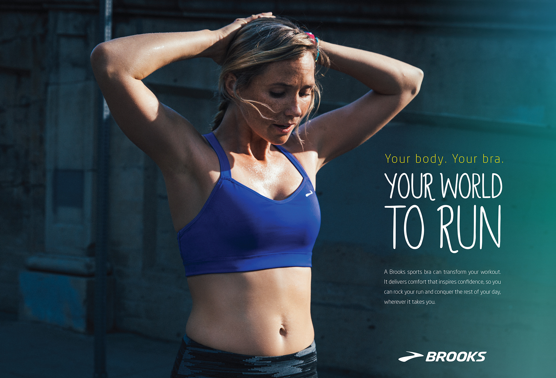
Your World To Run
Type Treatment
A Bra for Every Body
Type Treatment
Color Palette
Impact Levels
Bra categories with custom graphic logos
Photo with Graphic Treatment
EMEA retail graphics
EMEA Bra Cards
EMEA bra tags
Bra Fit Expert
Logo design
When Brooks Running decided to rebrand its sports bra line, the stakes were higher than a visual refresh. The existing marketing communicated to only a sliver of the actual customer base — photography had historically featured a single, smaller cup-size model, a limitation of vendor sample availability that had quietly created a significant credibility gap. Brooks carries bras in sizes XS–6XL and cup sizes A–G, but the apparel’s creative said otherwise. The rebrand was an opportunity to close that gap and build a visual system expressive enough to represent the full breadth of the product and the athletes who wear it.
I was the lead designer and visual strategist. I synthesized findings from employee and consumer focus groups into a research-backed pitch deck and presented a new creative direction to leadership — one that softened the palette toward more welcoming tones while staying within the Brooks brand color family, and proposed photography direction that would authentically reflect the product’s size range. The hardest part wasn’t the design; it was getting buy-in from teams invested in the existing direction. I reframed the conversation from aesthetic preference to brand integrity: the current approach wasn’t just a missed opportunity — it was actively contradicting what the product delivered. Once leadership saw it framed as a strategic gap, the investment required (including sourcing additional sample sizes from the vendor, planned nearly a year ahead of in-store launch) felt justified.
From there, I designed the full visual system: custom logos for each bra impact level, typographic treatments for all applications, an inclusive color palette, and photography direction for the future of the line. I documented the system comprehensively so retail, merchandising, and digital teams across channels could execute with confidence. The rebrand shipped across North American and global retail environments — window graphics, floor fixtures, fitting room cards, size charts — as well as e-commerce, digital advertising, and social, all visually consistent and strategically intentional.
Client: Brooks Running
Senior Designer/Art Director: Dianne Vallier
- Advertising Campaign
- Graphic Design